June 11, 2018
Data Is Power: Introducing the Speed Map Module

Swiftly

June 11, 2018
Data Is Power: Introducing the Speed Map Module
Swiftly
June 11, 2018
Data Is Power: Introducing the Speed Map Module
Swiftly
Lower speeds mean lower ridership
Transit speeds are declining across the country, and riders have noticed: experts say that slower speeds are closely connected to declining ridership. But at many agencies, planners often struggle to identify problematic intersections or congested stretches of road, only perpetuating ridership woes.
Proven solutions to these kinds of bottlenecks — like traffic signal priority (TSP), red lanes, and stop consolidation — all require cold, hard data, not only to identify the problems, but also to convince others of the solution.
Yet at most agencies, determining exactly where bottlenecks occur and measuring the impact can be challenging. And for agencies that do have access to granular data, it can take weeks to make sense of speed information and distill the findings into recommendations for stakeholders at city hall.
If you want to win over stakeholders in debates on TSP, priority lanes, or stop consolidation, data is power in getting things done.
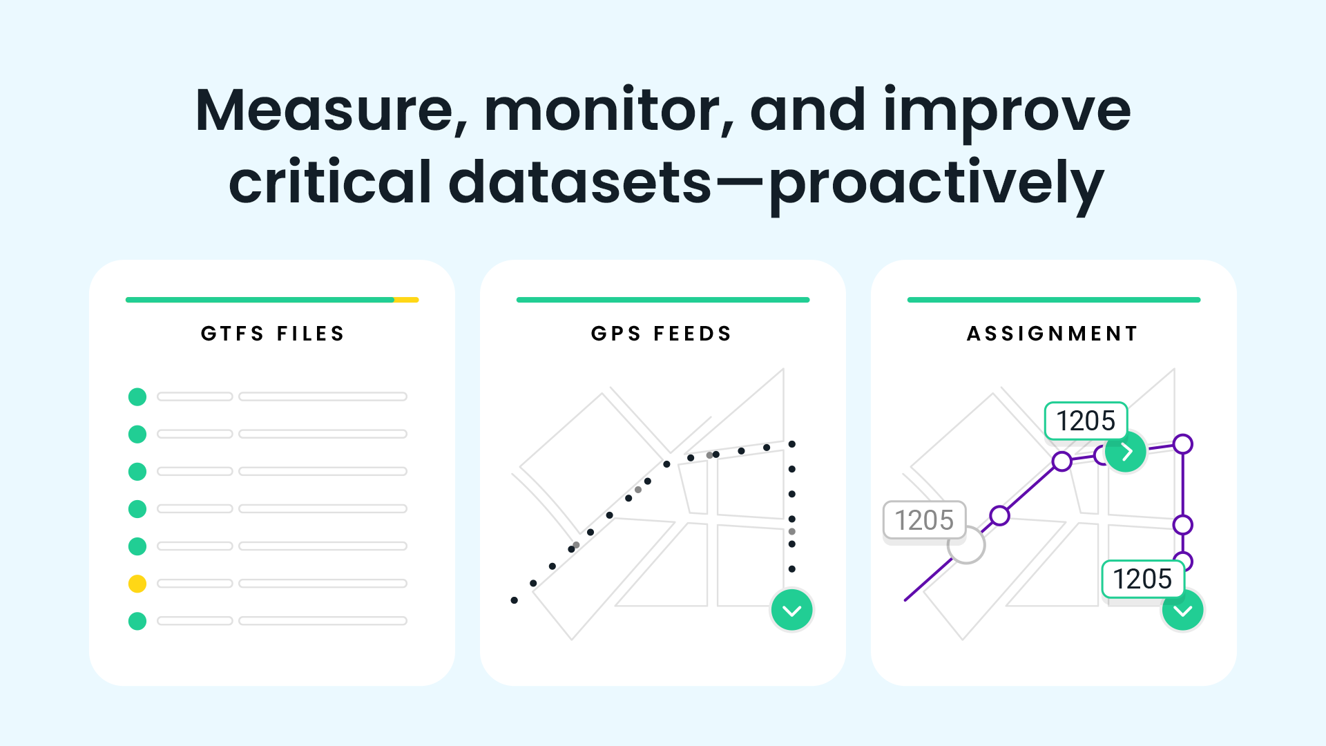
Introducing Swiftly’s Speed Map module
That’s why Swiftly has created Speed Map, a new module that immediately shows up-to-the-minute visualizations of where performance issues exist in your transit network.
With Speed Map, you can quickly:
- Identify the route segments and intersections causing performance issues
- Create intuitive visualizations illustrating vehicles speeds and dwell times for any route and direction
- Determine and quantify the impact of infrastructure projects on vehicles speeds and dwell times
In addition to identifying problem service areas, agencies can run Speed Map reports before and after capital improvement dates to immediately see effects on vehicle speeds and dwell times.
So instead of taking weeks to gather data, conduct a study, and write up a report, only to find that traffic conditions have changed, now you can quickly tell a story about the bottlenecks in your transit network, and easily convey why infrastructure projects would help. Because, as always, data is power.

To learn more about the Speed Map module, request a demo with the Swiftly team.
Request a demo
The rich text element allows you to create and format headings, paragraphs, blockquotes, images, and video all in one place instead of having to add and format them individually. Just double-click and easily create content.
Last Name, Agency

What’s a Rich Text element?
What’s a Rich Text element?
What’s a Rich Text element?
What’s a Rich Text element?
What’s a Rich Text element?
The rich text element allows you to create and format headings, paragraphs, blockquotes, images, and video all in one place instead of having to add and format them individually. Just double-click and easily create content.
Last Name, Agency
Static and dynamic content editing
A rich text element can be used with static or dynamic content. For static content, just drop it into any page and begin editing. For dynamic content, add a rich text field to any collection and then connect a rich text element to that field in the settings panel. Voila!
How to customize formatting for each rich text
Headings, paragraphs, blockquotes, figures, images, and figure captions can all be styled after a class is added to the rich text element using the "When inside of" nested selector system.
- text goes here
- text goes here
- text goes here
- text goes here
- text goes here
- text goes here


Swiftly, Inc.
2261 Market Street #4151
San Francisco, CA 94114
©2026 Swiftly, Inc. All rights reserved.


It looks like you're located in Spain.
¿Quieres visitar nuestro sitio web en español?
