August 18, 2021
Recap: Prioritizing Transit with a Collaborative Data Approach

Matt Fleck
Senior Product Marketing Manager

August 18, 2021
Recap: Prioritizing Transit with a Collaborative Data Approach
Matt Fleck
August 18, 2021
Recap: Prioritizing Transit with a Collaborative Data Approach
Matt Fleck
Senior Product Marketing Manager
Austin is the fastest-growing large city in the nation, having grown by more than 500,000 residents in the last decade. Unsurprisingly, this rapid growth has put a lot of pressure on the city’s transportation infrastructure; growing by 34% in ten years would take a toll on any city, but when paired with Austin's legacy of sprawling single-family zoning and a strong car culture, it’s been a recipe for intense gridlock. That’s why Capital Metro has joined forces with the City of Austin to introduce low-cost, high-impact projects to mitigate congestion in the city center.
In our latest webinar, “Prioritizing Transit with a Collaborative Data Approach,” we caught up with Nadia Barrera-Ramirez from Capital Metro to hear how Austin is implementing transit priority projects to relieve congestion and reduce transit travel times. Capital Metro recently introduced a 2-mile bus-only lane on one of Austin’s busiest corridors with the help of Remix and Swiftly collaborative approach to data. Here’s what we found out.
Implementing transit priority to improve speed, reliability, and safety
Capital Metro’s efforts around transit priority have focused on two key goals: enhancing customer access to transit, and improving the speed and reliability of service.
To achieve these goals, they turned their attention to East Riverside Drive, a nine-mile corridor that connects the airport in the east of Austin to the downtown area, traveling through densely populated neighborhoods and commercial districts along the way. Nine routes in all serve the corridor, accounting for a total of 20% of the agency’s entire weekday ridership. As such a key part of Capital Metro’s transit network, it was an easy candidate for improvements.

Capital Metro began with relatively simple improvements, like ensuring all bus stops were located on the far side of intersections to create more consistent run-times. But the keystone of the project was transforming two miles of the corridor into bus-only right-of-way in the curbside lane.
“We knew East Riverside Drive would benefit from bus-only lanes. Our projections showed time savings of 5 minutes in AM peak and 4 minutes for PM peak for the corridor, which is pretty huge, all without appreciably affecting private vehicle traffic.” —Nadia Barrera-Ramirez, Cross-Agency Transit and Mobility Programs, Capital Metro

After ironing out a few issues with cross-street signal timing, travel times for buses along the corridor dropped similar to what projections predicted.
Using a collaborative approach to transit data to implement changes
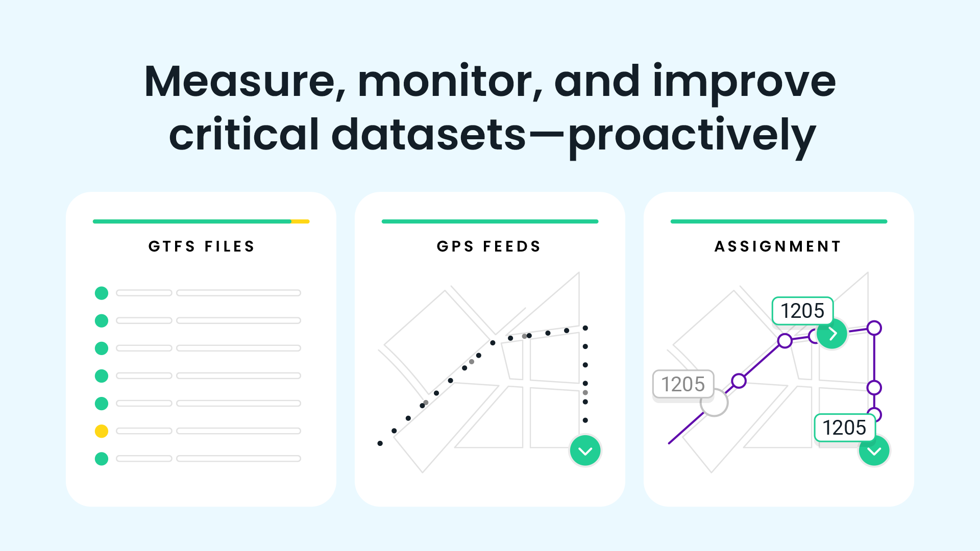
Instrumental to the entire project was the collaborative approach to transit data between Swiftly and Remix, which allowed the Capital Metro team to identify corridor segments for improvement, communicate the data to stakeholders at City Hall, and ultimately measure the impact of the project once implemented.
The Swiftly Speed Map data layer in Remix provided an interactive visualization of historical bus speeds and dwell times. Swiftly gathers GPS and speed data every three seconds, which has given Capital Metro a rich source of speed data visualized right in the Remix interface. Dwell times, too, are visualized in an intuitive manner -- the longer the dwell time, the larger the circle on the map. In the Remix platform, Capital Metro was able to toggle between Swiftly data and Remix’s native data layers, including demographic data like lower-income or elderly populations, painting an in-depth picture of the data that Capital Metro needed for pitching the idea to external stakeholders.

“We have a longstanding relationship with the City of Austin, and we know what they want to see. They want to see travel time data, speed data, and passenger load data. Having access to all of this in the Swiftly data layer in Remix definitely made it much easier to get this project off the ground.” —Nadia Barrera-Ramirez, Cross-Agency Transit and Mobility Programs at Capital Metro
Want to hear more about how Swiftly is working with Remix to offer best-in-class visualizations of transit data? Watch the full webinar recording here.
Request a demo
The rich text element allows you to create and format headings, paragraphs, blockquotes, images, and video all in one place instead of having to add and format them individually. Just double-click and easily create content.
Last Name, Agency

What’s a Rich Text element?
What’s a Rich Text element?
What’s a Rich Text element?
What’s a Rich Text element?
What’s a Rich Text element?
The rich text element allows you to create and format headings, paragraphs, blockquotes, images, and video all in one place instead of having to add and format them individually. Just double-click and easily create content.
Last Name, Agency
Static and dynamic content editing
A rich text element can be used with static or dynamic content. For static content, just drop it into any page and begin editing. For dynamic content, add a rich text field to any collection and then connect a rich text element to that field in the settings panel. Voila!
How to customize formatting for each rich text
Headings, paragraphs, blockquotes, figures, images, and figure captions can all be styled after a class is added to the rich text element using the "When inside of" nested selector system.
- text goes here
- text goes here
- text goes here
- text goes here
- text goes here
- text goes here


Swiftly, Inc.
2261 Market Street #4151
San Francisco, CA 94114
©2026 Swiftly, Inc. All rights reserved.


It looks like you're located in Spain.
¿Quieres visitar nuestro sitio web en español?
