July 31, 2018
Time for a refresh: Meet the new Swiftly Dashboard

Swiftly

July 31, 2018
Time for a refresh: Meet the new Swiftly Dashboard
Swiftly
July 31, 2018
Time for a refresh: Meet the new Swiftly Dashboard
Swiftly
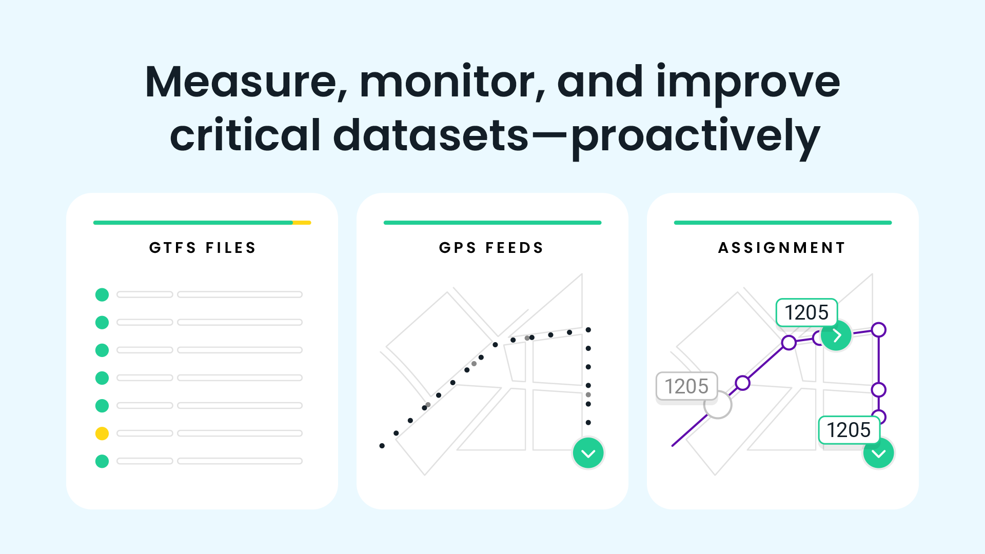
Swiftly develops enterprise software to help transit agencies and cities improve urban mobility. Launched in 2016, we have grown to partner with over 50 cities to improve public transit for over 2 million riders per day.
Our product line has expanded considerably as well. We’ve developed five unique dashboard modules that provide real-time information and historical data analytics.
Why a refresh now?
First, we’ve released many product updates over the last few years to provide deeper access and insights for our users. Making rapid changes and squeezing in more features led to some design inconsistencies and usability issues. We wanted to clean this up.
Second, we plan to update our product a lot more. Our customers have been essential in providing valuable feedback on their evolving needs, and we need a strong foundation to support new features.
What’s changed?
After listening to our customers on how we can serve them better, we’re excited to share our new improvements. Our new dashboard design is:
1. Optimized for your screen size
The majority of our users were viewing our dashboard on a screen size of 1200 x 750 pixels, which is more comparable to a laptop than the larger desktop screen that we were designing for.
With the side panel and top bar filters taking up nearly 40% of the screen, there was little space left for the most powerful part of our platform: the data. To solve for this, we moved filters to the left side with our module selections and made both panels collapsible, expanding only when the user needs more information.

2. Easier to edit
Instead of blocking the entire screen with an ephemeral filter pop-up, the filter edit card now slides in, keeping the user in the context of the module view.
We also group like filters (e.g.- date & time, display) and allow them to be edited separately. Our previous filter page displayed all the functionality available at once, which crowded the interface and made the page more difficult to use. Now, our filters are organized and prioritized to follow how our users interact with their data.

Before | After
3. More transparent on filter selections
Our platform empowers our users to interact and manipulate their data based on the task at hand. When dates or On-Time Performance parameters are changed, it’s critical that our dashboard confirms these filter changes.
Previously, we did not have the real estate to display all selections. If a user selected a date to exclude, they would have to reopen the filter pop up card to confirm the selection was saved.

Now, we have all filter selections displayed next to the data visualizations. This allows easy scanning of your data parameters.

We wanted give our dashboard a refresh, but not completely change what has been working for our customers. That’s why you’ll see that we’ve updated our layout and filters, but the dashboard still provides the same powerful data visualizations and insights as it did before.
At Swiftly, our customers are the center of our product philosophy. We believe that the earlier and more often we get their feedback, the better and more focused our product will be in solving our users biggest problems.
We extend a big thanks to more than 50 transportation agencies who use the Swiftly Dashboard to find high-impact areas for improvement in their transit networks and who have informed our work thus far. We look forward to hearing feedback about the changes!
Looking to find actionable insights in your transit data? Swiftly works directly with transit agencies and operators to show where, when, and why issues are occurring in real time and historically. Email our team at contact@goswift.ly if you’d like to learn more!
Request a demo
The rich text element allows you to create and format headings, paragraphs, blockquotes, images, and video all in one place instead of having to add and format them individually. Just double-click and easily create content.
Last Name, Agency

What’s a Rich Text element?
What’s a Rich Text element?
What’s a Rich Text element?
What’s a Rich Text element?
What’s a Rich Text element?
The rich text element allows you to create and format headings, paragraphs, blockquotes, images, and video all in one place instead of having to add and format them individually. Just double-click and easily create content.
Last Name, Agency
Static and dynamic content editing
A rich text element can be used with static or dynamic content. For static content, just drop it into any page and begin editing. For dynamic content, add a rich text field to any collection and then connect a rich text element to that field in the settings panel. Voila!
How to customize formatting for each rich text
Headings, paragraphs, blockquotes, figures, images, and figure captions can all be styled after a class is added to the rich text element using the "When inside of" nested selector system.
- text goes here
- text goes here
- text goes here
- text goes here
- text goes here
- text goes here


Swiftly, Inc.
2261 Market Street #4151
San Francisco, CA 94114
©2026 Swiftly, Inc. All rights reserved.


It looks like you're located in Spain.
¿Quieres visitar nuestro sitio web en español?
